|
|
Post by propertea1 on Dec 22, 2009 16:49:29 GMT -8
eyeneversleep, you know ja is kind of taken already by a big ny head right? It says YA actually. |
|
|
|
Post by propertea1 on Dec 28, 2009 11:09:26 GMT -8
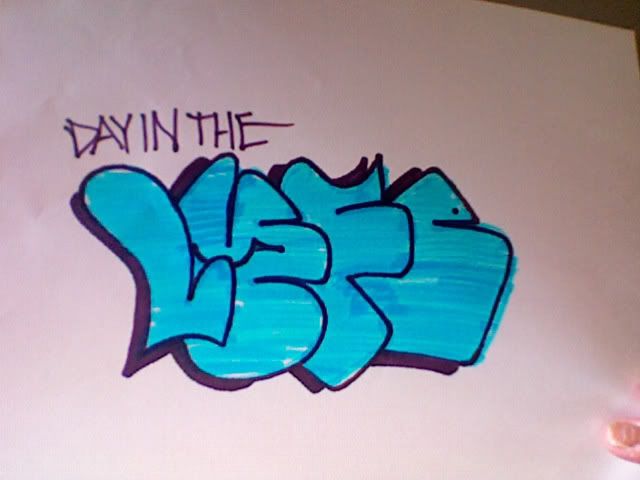 For the Day In the Lyfe contest. Should I submit it? |
|
|
|
Post by adamitron on Dec 28, 2009 12:02:16 GMT -8
thanks for setting me strait tea, and i'd say submit it. the only thing i would change is filling in the spot between l and y with the 3d colour, and maybe arch the bottom of the e a little to match the l, but maybe i'm just too concerned with symmetry.
|
|
|
|
Post by deforglory on Jan 9, 2010 18:10:02 GMT -8
y is a banger
|
|
|
|
Post by holy on Jan 26, 2010 3:02:12 GMT -8
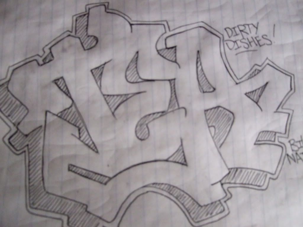
 trying to do some letters. crits are welcome. i would also like to hear some general advices about letters. |
|
|
|
Post by Narcoze on Jan 26, 2010 7:44:33 GMT -8
you've got those letters down really well!
generally you always wanna keep letters lookin proportional and you did so thats about it from me.
|
|
|
|
Post by adamitron on Jan 26, 2010 20:16:20 GMT -8
those are real nice, i like the third one the most, but i would do something a little different with the y, namely the part that comes off the left hand of it, it closes it up and makes it look like a g to me.
|
|
|
|
Post by propertea1 on Jan 30, 2010 13:13:59 GMT -8
 Can't get my A's looking right, and I keep trying to force the T-A connection |
|