|
|
Post by 5kynyn31zan00b on Nov 5, 2008 16:56:19 GMT -8
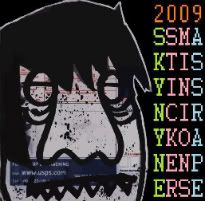
lol BTS is john madden with thta diagram  |
|
|
|
Post by cybot on Nov 5, 2008 18:20:13 GMT -8
 I need some computer editing magic but I have no fairy powers. And I need a no shine pic. Oh well. |
|
|
|
Post by cybot on Nov 5, 2008 18:20:41 GMT -8
Oh yeah thats silver on the rings but ya cant see it.
|
|
|
|
Post by .UWP.. on Nov 5, 2008 20:32:45 GMT -8
dude thats awesome!!
|
|
|
|
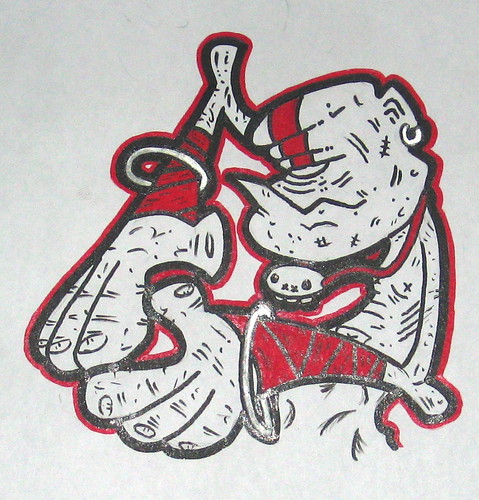
Post by 14bolt on Nov 5, 2008 20:58:15 GMT -8
Quick example..... just some possibilities. I think you should use air bubbles if he's underwater.... maybe not as many as i used?? Anyways bro. just wanted to give some inspiration.  |
|
|
|
Post by .UWP.. on Nov 5, 2008 21:19:59 GMT -8
holy shit 14bolt!! you the man!
thanks dude for hookin this up.
i worked for like 4 hours tonight redoing the one im working on.
its turning out way way better. new colour design and everything.
this is great though man!! really kind of ya to wip me up some action right here!
|
|
|
|
Post by cybot on Nov 6, 2008 9:29:38 GMT -8
Thanks UWP! The bubbles are sick and should be included. I also love the big jersey like 33. The rest of the crew should do some with like the same 33 in the back. Thad be siiiiick.  Vector magic + paint |
|
|
|
Post by nano on Nov 6, 2008 12:43:11 GMT -8
^ oh dear geebus...what a train wreak.
Señior Cybot hit me up wif your files and ideas and i'll help you out.
thats a kick ass drawing, dun want it failing cause of poop-e paint skillz.
|
|
|
|
Post by .UWP.. on Nov 12, 2008 6:24:26 GMT -8
so i re-worked the design and i like it alot better, but i had a few test prints done and it seems the original colourway of the pirates sweatshirt was better than now. definetly a process.
|
|
|
|
Post by cybot on Nov 12, 2008 8:59:00 GMT -8
WHEN DO WE GET TO SEE?
Im still waiting for Nano to hook it up witha layout.
|
|
|
|
Post by nano on Nov 12, 2008 11:32:00 GMT -8
WHEN DO WE GET TO SEE? Im still waiting for Nano to hook it up witha layout. sorry man, not my best. deleted--- pure wackness.  feeling unmotivated lately.  |
|
|
|
Post by erase on Nov 14, 2008 11:23:04 GMT -8
14bolt, love the touch of yellow in the underwater theme there
nan0, it wasn't THAT wack...
I have a couple SFII chops on my flickr... I might put up a couple more, but I only wanna print one... I'm leaning towards the Akuma... but lemme know what y'all think
|
|
|
|
Post by eyeneversleep on Nov 16, 2008 16:39:19 GMT -8
im gonna try one of these out...hmm
|
|
|
|
Post by deremony on Nov 19, 2008 2:20:36 GMT -8
brighten up that sea water. looks all vintage and shit. takes away from the clean cut and vibrant character!
|
|
|
|
Post by .UWP.. on Dec 5, 2008 7:40:18 GMT -8
 first off let me say sorry for the bad picture, my scanner isnt working to great right now. anyway, i like it and i dont. i like the overall design but i want the 33 in the top right corner to ''pop'' a little bit more. i dont want to change the blood colour though. i like the green out line and the colours of it all, but i think they need to be brighter. i feel like they printed a bit darker than i expected. the stick fighter logo - i left out the thin white outline, which originally i liked, but now i dont. so i think i got some changes to make. i got like 100 printed so i sent out a few to people i owed trades to, i figure ill rework it when i run out.  im pretty psyched IKARI stuck this one up in this awesome combo in Germany. i dont really put up any of the new printed ones i have, i want to save em for packs for the new year. ill only stick them up in philly if i run out of drawn ones. pretty cool to see some other sticker minions fools here to - Tarkinson, and 14 Bolt (who i might add probly has the sickest stick fighter sticker ever). |
|